
Get Started
Content Outline
Why Webex Experience Management?
Webex Experience Management is a cloud application that can help you understand your customers needs and improve your products or services to meet their expectations.
Here’s how Webex Experience Management can help you delight your customers today.
-
Step into your customer’s shoes with our customer journey map and visualize their experience
-
Track and measure metrics such as Net Promoter Score (NPS) and Customer Satisfaction (CSAT)
-
Collect actionable customer feedback with our end-to-end CX dashboard
-
Uncover the root cause of good, bad or terrible customer service
-
Get instant email updates on NPS trends and response rate trends
-
Respond to negative feedback in real-time using tickets and reduce churn
-
Leverage our predictive tools to anticipate customer needs and improve loyalty
During your first week, refer back to this guide to get important questions answered. Enjoy your exploration and here’s to customer delight!
How to log in to Webex Experience Management
Log in using the credentials provided to you by your administrator. Visit https://xm.webex.com/
| Visit Login Page | Enter Email and Password |
|---|---|
 |
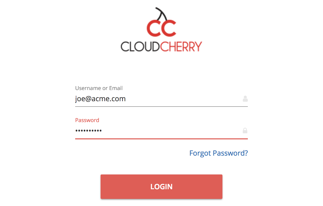 |
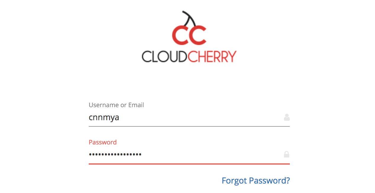
You may choose to log in either using your email address or your Webex Experience Management userid. Your Webex Experience Management userid is a combination of a brand userid (like cnn) and a personal moniker (like mya).
| Login via user id (Optional) | Forgot Password |
|---|---|
 |
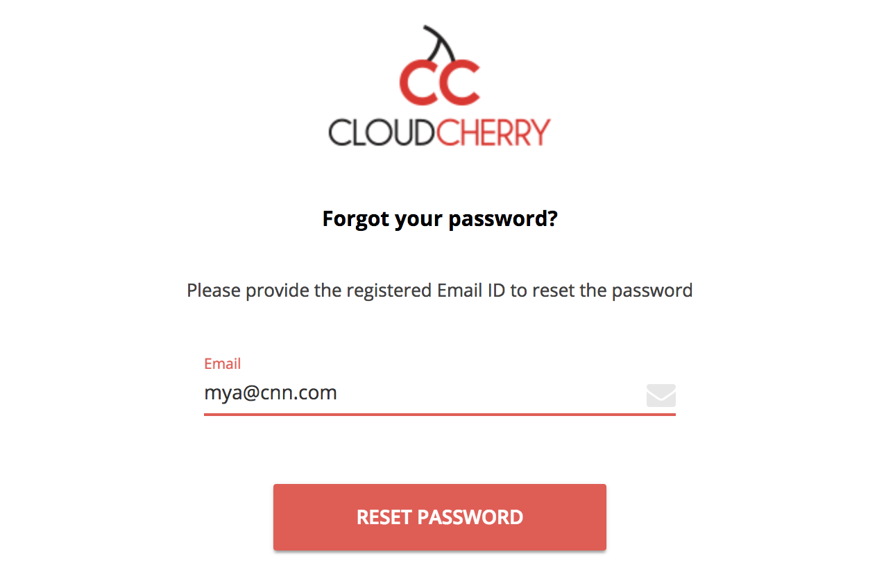 |
If you have trouble logging in, or are unable to remember your password, just hit Forgot Password and follow the on-screen instructions to get a reset password link sent to your registered email address.
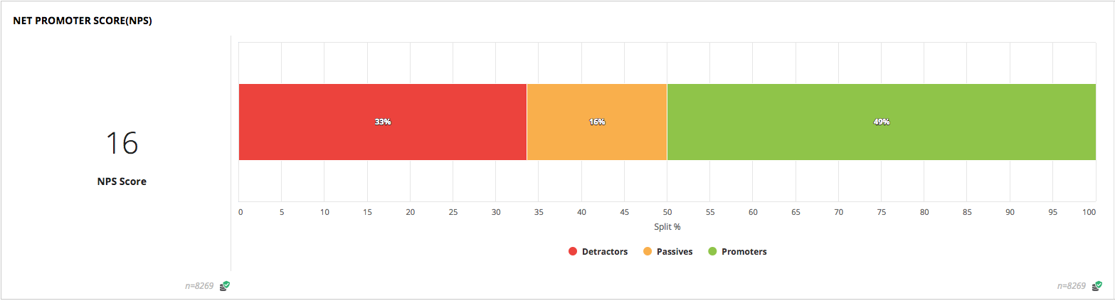
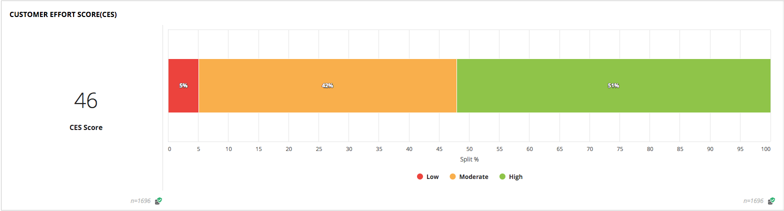
Know the pulse of your customers
We help track the overall pulse of your customers through industry standard metrics such as Net Promoter Score (NPS), Customer Satisfaction(CSAT) and Customer Effort Score (CES).
| Net Promoter Score | Customer Effort Score |
|---|---|
 |
 |
When you visit the Metrics section, you can see widgets that let you check at a glance what your overall scores are.
The other key indicator of performance is through metrics that help you regularly check key aspects that matter to your customers to see how you are doing. These can be configured to track aspects relevant to your business.
While it is helpful to look at overall CX scores like NPS, CSAT and CES, these offer a high-level view. In terms of NPS scores, you may be interested in digging deeper than just looking at the broad summary of Passive, Promoter and Detractor. A deeper dive into individual CX metrics like NPS provides a better understanding of the spread of the score, for instance, looking at the NPS Scorecard with the spread across 0-10.
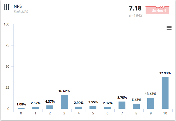
In this example, the key insight that is actionable is that 8.4% of the customers rated you at 8 and are candidates to be made promoters, driving an increase in the NPS. Also, there’s a significant number of customers that have rated you 3.
Is your performance improving over time?
The first quick indicator of uptrends and downtrends of key metrics is visible right on your NPS/CES widget. At a glance, this helps you understand whether the overall experience of your customers has increased or decreased over time.

The example shows a downtrend of NPS by 3%. This compares the current period (number of days) selected in the date filter with the previous period. For instance, if the date filter selected is for the last 7 days, this would compare the last seven days with the previous seven days to indicate an uptrend or downtrend.
To understand broader trends over time, take a look at NPS Trends.
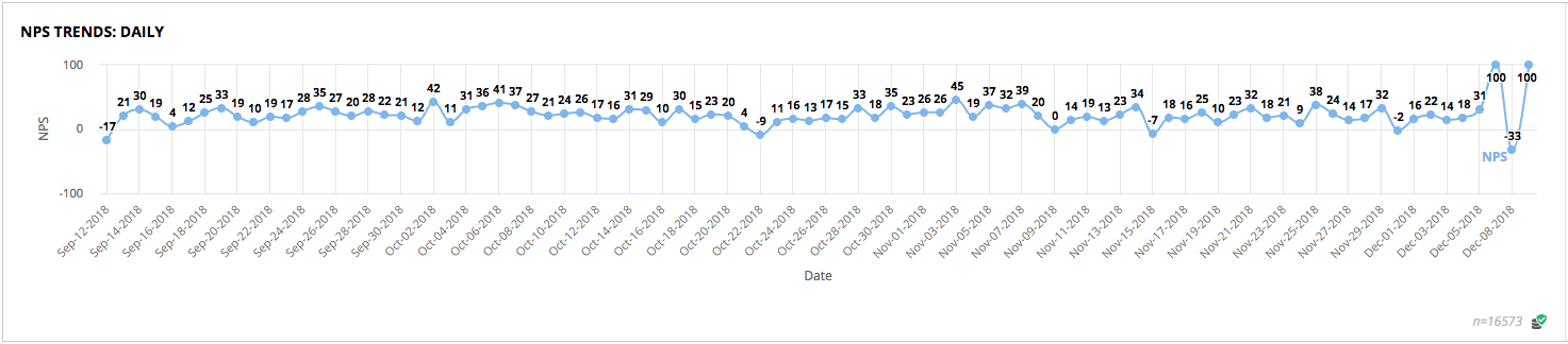
This presents an overall view of NPS over the selected date range to understand at which points there may have been significant uptrends or downtrends. This opens up opportunities to understand whether the trend was due to changes made, and whether efforts being made are having an impact.
Spot patterns in what customers are saying
Customers may be talking about you and voicing their opinions in a number of places. We extract their voices from various sources, including text comments in surveys, social media and email inboxes. All of these comments are then mined to unearth patterns about what customers are saying so that you don’t need to spend time reading every single response.
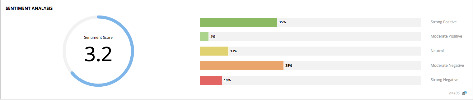
Text analysis of the comments is presented on a 5-point scale between Strongly Negative and Strongly Positive.
This will help you measure positive and negative feedback among your customers. It provides insight into the emotional tone behind a series of words, an understanding of the attitudes of customers, and the tonality behind what they are saying. Clicking on any of the bars in the chart will let you drill down to read the specific comments and understand them better.
One of the important things for a business is to stay ahead of consumer trends before they are trending. By spotting emerging patterns of the topics customers are talking about, you can proactively take action.
The Word Cloud presents an easy, user-friendly visualization of commonly occurring words in the comments so you know what users are talking about. These comments may come from open ended questions in surveys, social listening feeds, emails being forwarded to Webex Experience Management, or other unstructured data sources.
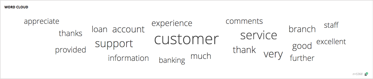
The more often that a certain word appears in unstructured text sources, the larger it will appear in the Word Cloud. The Word Cloud is fully interactive, and you can click to drill down into the Responses further.
If you spot less relevant words that you’d like to have removed, just notify your Webex Experience Management admin and they can filter them out via the configuration options in Settings.
What should you prioritize to work on first?
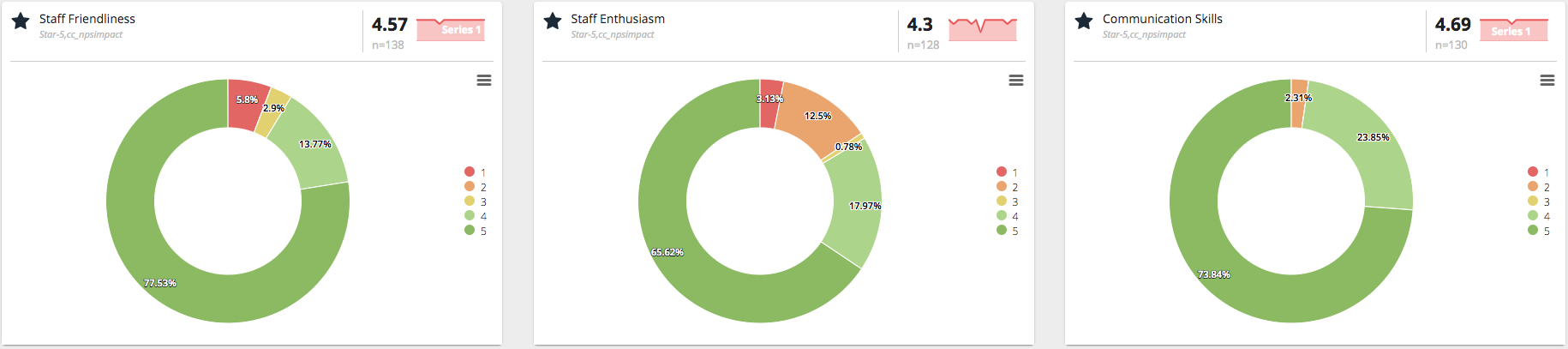
The Most Liked and Disliked widget helps you understand how your customers have rated you. This is based on calculating the average scores about different aspects of your performance posed in rating questions.
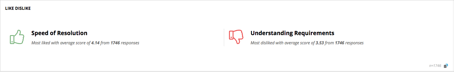
At a glance, it may appear that it will be most impactful to work on the aspects where your customers have rated you the lowest. However, this may not always be the correct response. In addition to customer ratings, ensure that you evaluate the relative importance of all aspects in play in the overall customer experience.
The hierarchy of importance is identified through a simple predictive modeling technique called regression analysis that can be visualized using Webex Experience Management’s interactive NPS Impact Analysis widget. It enables you to estimate the causal impact of all aspects on the overall customer experience.
Let us consider the following Financial Services sample data.
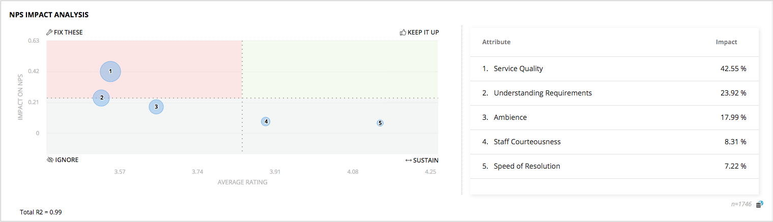
The quadrants plot each aspect on the coordinates of “How important is that aspect in driving customer experience” and “How strong is the business currently in delivering that aspect to the customer”.
The chart presents 4 quadrants to help identify areas of impact that need action.
| TOP PRIORITY - FOCUS HERE FIRST | HIGH IMPACT - KEEP UP THE EXCELLENT WORK! |
|---|---|
| These are low hanging fruit that present the immediate areas to focus organizational energy on. Increases in these ratings will have significant impact. Ensure you focus your CX efforts here and prioritize action to shifting these towards the right. | After Top Priority items, these are areas to continue to pursue aggressively to retain pole position. A drop in ratings here will have high impact on CX. |
| IGNORE - LOW PRIORITY | SUSTAIN - POSSIBLY IGNORE |
|---|---|
| These are best ignored completely. Although these customer ratings are low, they do not have an impact on the overall metric. | These are areas where customers have rated you highly, but are less impactful. If you need to choose, you may opt to prioritize Top Priority and High Impact areas. Reducing efforts in these areas will not impact experience but might provide the brand with useful aspects of differentiation. |
Are concerns consistent and trending over time?
A quick look at Metrics or key questions that you want to examine in Response Analysis will help you look at current scores as well as the trend. The trend is presented as a “Spark Line”, the little trend line chart on the top right of each scorecard, much like stock market charts so that you never miss out on changes.
How do I drill down into these concerns?
Just click on the areas of the Metrics you are interested in to drill down into the numbers. For instance, if you notice that 20% of your customers have rated you 1 out of 5 in Timeliness of transaction, you can click on the slice of the pie in red to drill down further.
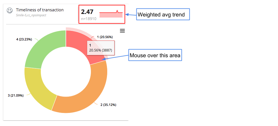
And it doesn’t stop there. You can choose to continue to drill down to get to answers you need. Click on other metrics like Channels, Touchpoints, Gender, etc. to dig deeper to understand your customers. At any point, if you’d like to understand the verbatim comments that explain the ratings, just switch over to the Responses section and the drill down filters will carry over so that you don’t need to apply them again.
What are customers suggesting that we improve?
Beyond Word Cloud, the next level of analysis is Theme Analysis. This goes beyond counting words or phrases, and identifies clusters of related topics in the comments. These topics usually map to key aspects of your business that matter in the context of customer experience, and often include specific suggestions about areas of improvement for you to take action on.
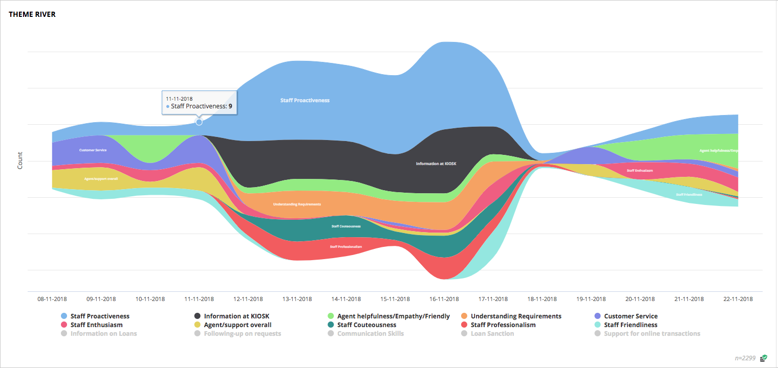
Themes can be examined in the context of metrics like NPS to understand which areas customers are happy or unhappy with. You may also choose to set up email notifications based on trending thematic topics so you stay in the loop.
Sometimes the easiest way to understand what to do may be to just ask your customers.
Posing a simple question can lead to an actionable answer.
What can we improve?
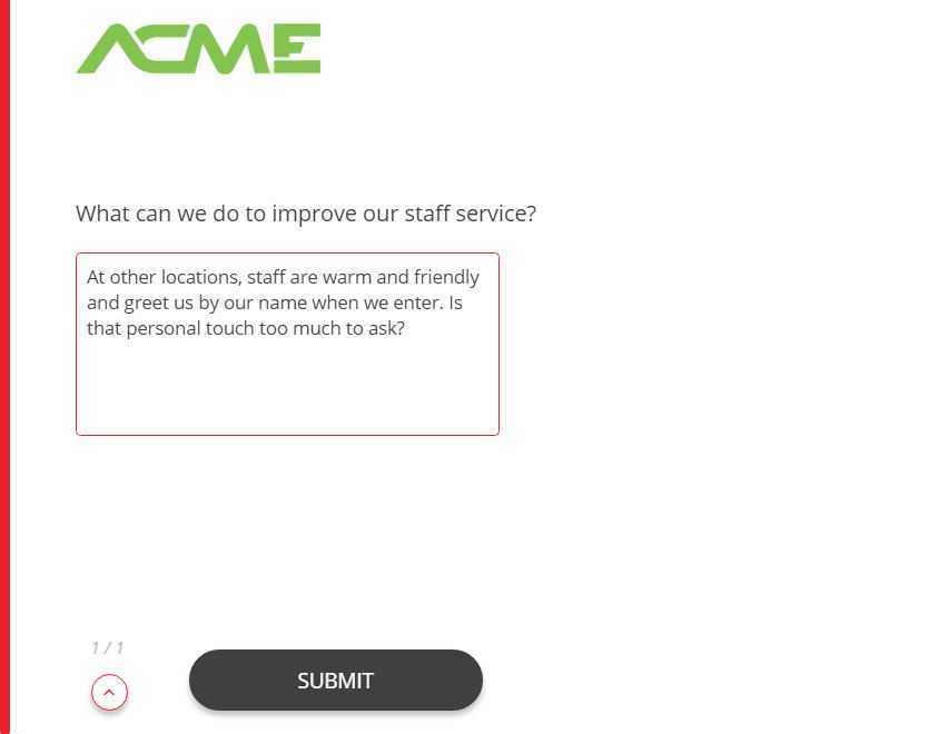
What can we improve upon the most?
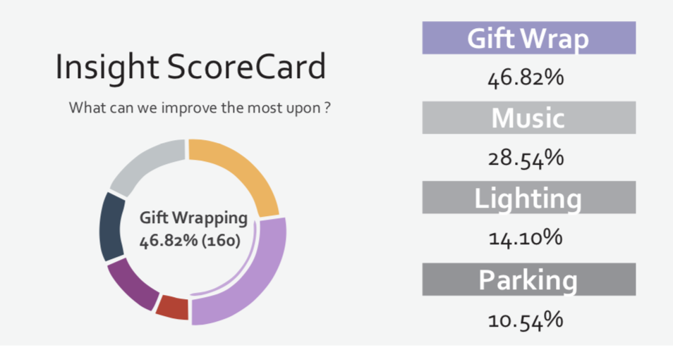
Contrary to the common wisdom that big budgets are needed to improve satisfaction, improving the smallest of things like a more welcoming greeting can lead to a large increase in customer experience, and in turn lead to growth.
Compare your performance across different customer journeys
Not all your customers are the same. Their journeys with you are unique due to differences in the products or services consumed, the touchpoints at which they interact, the demographics they belong to and their own interpretation of the promise of what your brand provides.
Visualizing customer journeys
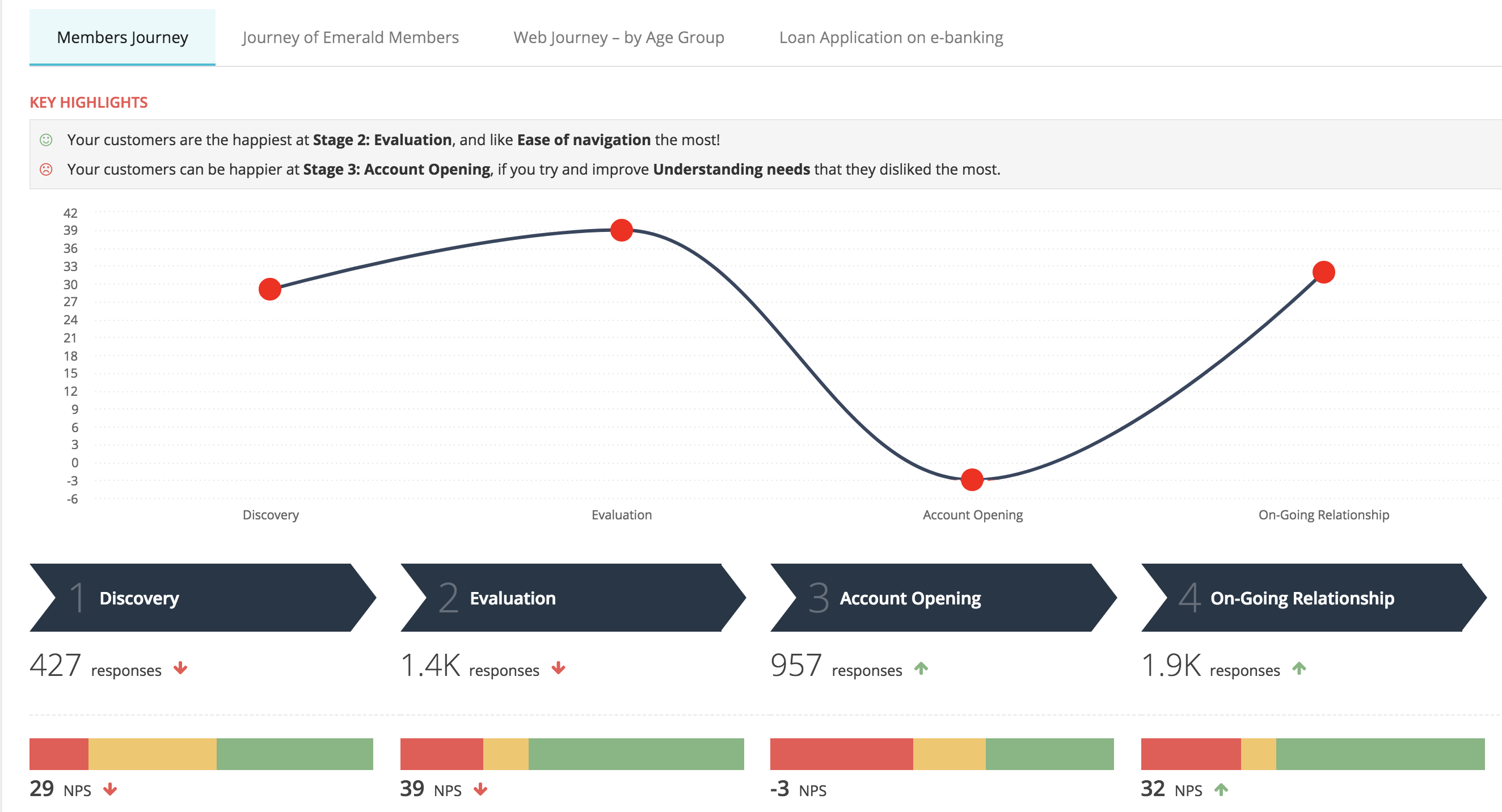
The curve plotted helps you quickly visualize the high points and low points of the journey of your customers. In this journey, Account Opening is the stage where customers are the most unhappy.
Segmenting customers by their journey
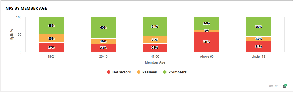
To investigate how customers of different demographics, geography, touchpoints, channels, loyalty tiers and campaigns may feel about their experience with you, explore the different Segments to identify areas that need improvement.
| NPS By Age | NPS By Stage |
|---|---|
 |
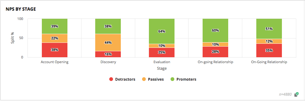 |
For instance, take a look at the examples above. Exploring NPS across different age groups may help point to challenges senior citizens are having with accessing information on your mobile app. In the second example, looking at NPS across different journey stages may reveal that the ongoing relationship stage needs attention.
Compare your performance with industry peers
Metrics like NPS vary significantly by geography and by industry. An NPS of 35 may be below average in retail where Amazon sets a high bar on experience, but an NPS of 10 maybe be good enough in another sector where regulatory forces limit consumer choice.
One of the ways for you to evaluate how you are doing on customer experience is to compare your NPS scores with your peers in the same industry and geographic location. The NPS Benchmark widget provide this data quickly at a glance.
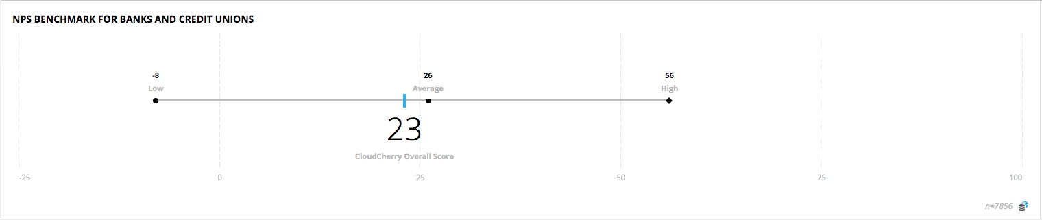
The two main sources of our data are anonymized NPS scores from our customers and 3rd party benchmark surveys.