
Prioritize Action
Content Outline
What should you prioritize to act on first?
The Most Liked and Disliked widget helps you understand how your customers have rated you. This is based on calculating the average scores about different aspects of your performance posed in rating questions.

At a glance, it may appear that it will be most impactful to work on the aspects where your customers have rated you the lowest. However, this may not always be the correct response. In addition to customer ratings, ensure that you evaluate the relative importance of all aspects in play in the overall customer experience.
The hierarchy of importance is identified through a simple predictive modeling technique called regression analysis that can be visualized using Webex Experience Management’s interactive NPS Impact Analysis widget. It enables you to estimate the causal impact of all aspects on the overall customer experience.
Let us consider the following Financial Services sample data.
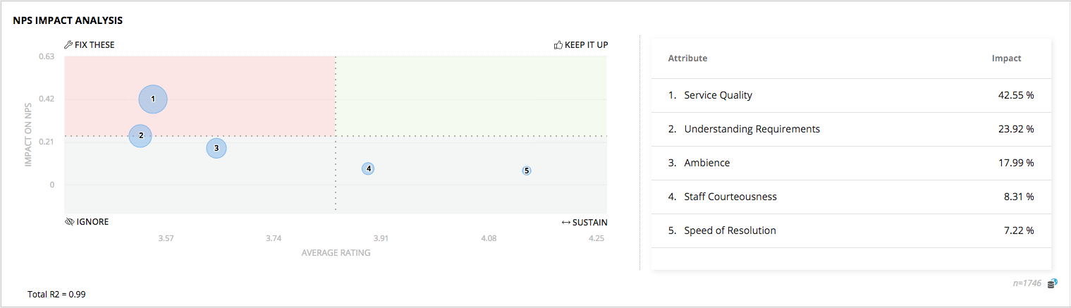
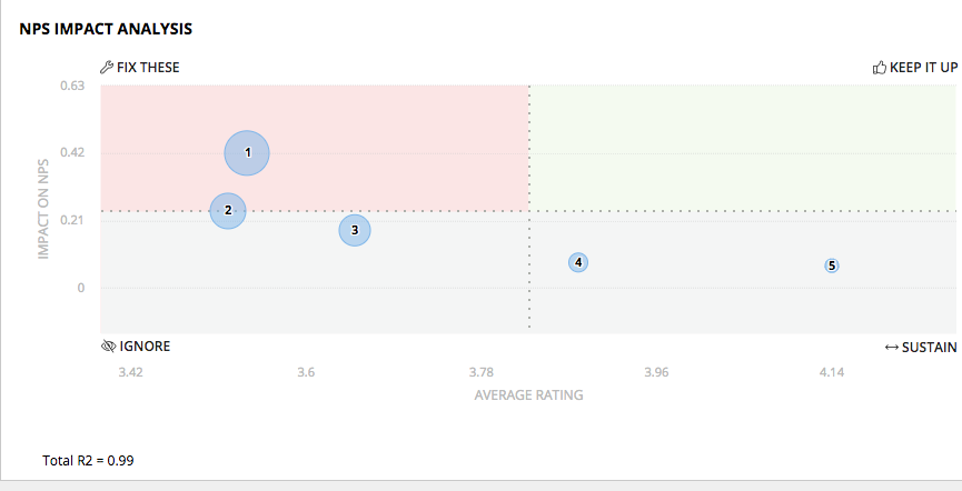
The quadrants plot each aspect on the coordinates of “How important is that aspect in driving customer experience” and “How strong is the business currently in delivering that aspect to the customer”.
The chart presents 4 quadrants to help identify areas of impact that need action.
| TOP PRIORITY - FOCUS HERE FIRST | HIGH IMPACT - KEEP UP THE EXCELLENT WORK! |
|---|---|
| These are low hanging fruit that present the immediate areas to focus organizational energy on. Increases in these ratings will have significant impact. Ensure you focus your CX efforts here and prioritize action to shifting these towards the right. | After Top Priority items, these are areas to continue to pursue aggressively to retain pole position. A drop in ratings here will have high impact on CX. |
| IGNORE - LOW PRIORITY | SUSTAIN - POSSIBLY IGNORE |
|---|---|
| These are best ignored completely. Although these customer ratings are low, they do not have an impact on the overall metric. | These are areas where customers have rated you highly, but are less impactful. If you need to choose, you may opt to prioritize Top Priority and High Impact areas. Reducing efforts in these areas will not impact experience but might provide the brand with useful aspects of differentiation. |
Gaining richer, actionable insights
The X-axis series of the chart is the average or mean rating for each of the questions configured for the widget.
The Y-axis series of the chart is the Adjusted R-Square, indicative of impact on NPS for each of the rating questions.
Here is an example of what tabular data corresponding to the chart above might look like.
| Attribute | Average Rating | Impact Score | Impact % | Priority |
|---|---|---|---|---|
| Branch Ambience | 2.46 | 0.4 | 59% | 1 |
| Staff Friendliness | 4.6 | 0.19 | 33% | 2 |
| Understanding Needs | 4.8 | 0.1 | 5% | 3 |
| Waiting Time | 4.4 | 0.05 | 1% | 4 |
The column representing Impact % is important to understand. Although there were 8 rating questions posed to the customer, only 4 of them had an Impact Score of > 0.05. And when relative importance between them as proportions is observed, two of the attributes constitute > 90% of impact on experience.
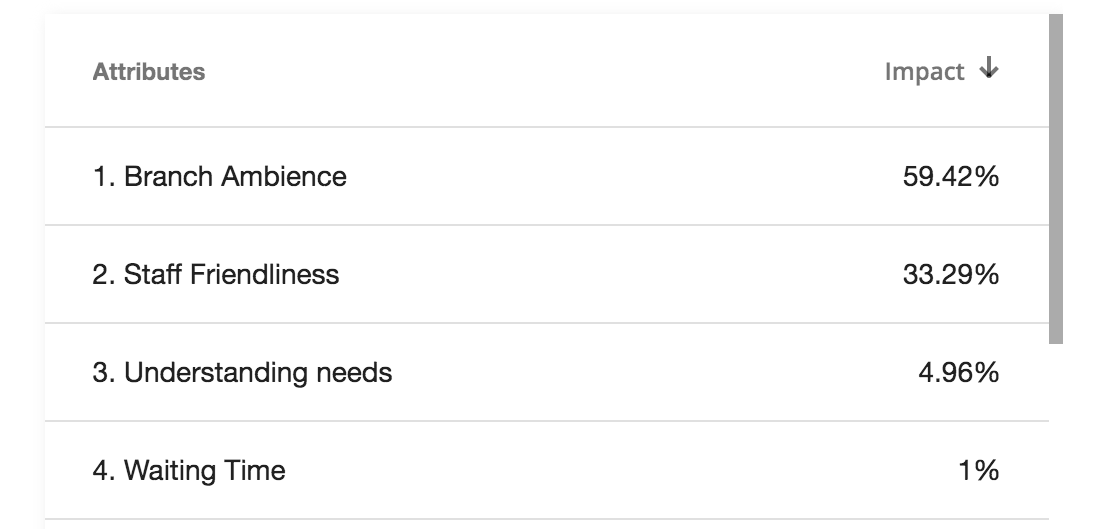
Herein lies the important insight - the experience of your customers is often impacted the most by a few aspects. Understanding what it is that really moves the needle and what is top priority can greatly help to focus efforts on maximizing the ROI of your initiatives.
- Review Impact Analysis with no more 8-10 attributes. A simple model is preferable to a complex model, and overfitting can affect results.
- Explore Impact Analysis in the context of related attributes for analysis.
- For instance, looking at contact center attributes along with branch attributes together may not always make sense if these are disconnected in the experiential context.
- Ideally use attributes that are asked in a single survey to setup the impact analysis.
- If certain attributes were asked based only on certain logic conditions, keep this in mind while interpreting the results.
- Set up all the attributes as questions on the same scale (5-point, 7-point) for ease of interpretability, even if normalization may produce the correct results.
- In certain cases, multiple attributes may be closely correlated with each other. This may require changes to your questionnaire or removal from the Impact Analysis setup to offer better analysis.
Did your work have an impact?
In order to understand whether efforts taken to impact CX scores have an impact, the simplest way is for you to track and compare trends period-over-period.
We recommend initiating efforts on a cycle either at the beginning of the week or the month, and then comparing performance against the previous period. For instance, comparing the trend of Apr 1 to Apr 30th versus May 1 to May 31st.
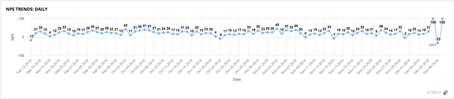
Note that depending on the nature of your business, certain impacts may be seen only over a longer term and may need comparison against quarterly results.
Refer to our Monitoring Trends section in order to learn more about how to track trends and receive notifications about uptrends or downtrends so that you know when your scores are changing!
How the Analysis is calculated
Impact Analysis is based on multiple regressions run using a linear model function, followed by calculation of the relative importance of the regressors. Our implementation is independently verified based on our research, and optimized to handle real-time computation with large volumes of responses and several regressors at scale. If the Adj-R square value is below 50%, the model indicates lack of good fit. For data analysts or data scientists who seek to analyze the results further, we support the ability to import responses into R for further analysis.
Predictive Insights with Path Analysis
Drug manufacturers spend billions of dollars annually going through careful research studies to ensure that introducing a new drug in a controlled environment leads to real improvements without placebo. These are important since the mistakes can bankrupt a pharmaceutical business.
Similarly, business users about to make a million dollar investment need dependable and robust insights to validate strategic decisions being made.
Strategic decisions happen every day, and may include
“Should we take this new product idea to the market?”
“Will customers like this massive redesign of our branches?”
“How will customers respond to changes in our pricing plans?”
“Should we enter new markets and geographies with new retail locations?”
“What if we reduce our branches to cut costs and replace them with video ATMs?”
and so on, all of which have significant time and cost implications when decisions go wrong.
Speed to insight is critical, and waiting for months for a report from a research agency can cripple a business in today’s world of fast changing market conditions.
Fortunately for Webex Experience Management users, since we already listen to your customers, and aggregate data from multiple systems for a 360 degree view, there’s no waiting involved.
Advanced analysis, much like those used by drug companies is possible by using our Path Analysis module. It enables establishing causation using structural equation modeling. This enables advanced experimentation and what-if scenario modeling, providing decision makers with a strategic decision making tool.
Establishing Causation
While the quote, “Correlation is not Causation” is often used by data analysts and data scientists, how to determine causation is a more difficult exercise.
If we were to just correlate observations around together the way the ancients did several thousands of years ago, we may establish that both the morning sunrise and the rooster crowing lead to John waking up.
Someone may observe that sunshine helps crops. And since the rooster and sunshine happen together, the rooster helps crops. For someone strictly looking at observations, there is a natural correlation between the events.
Today, we live with knowledge of causation about what drives what.
In the context of customer experience, arriving at causal models from data alone is hard since there are several related aspects of the business in play. Here’s an example that shows how different aspects are interlinked.
For instance, both “Ease of finding things” and “Range of Products Offered” may have influence NPS, but may have also have influence on the other. Or, the impact of weekend crowds on millenials with short attention spans and seeking instant gratification may not be immediately discerned.
This is where Path Analysis comes in, and enables solving for multiple predictions of multiple attributes in a model. Interplay between attributes is uncovered with path analysis by solving simultaneous equations using structural equation modeling (SEM).
Path Analysis enables exploring the relationship between the related attributes to understand each of their contribution, and to understand what will actually move the needle.
For the CX Researcher
The CX data researcher plays a key role in understanding the business context, ensuring the right questions are asked, developing a purpose for the investigation, and validating model fit. And all of this is possible using Path Analysis real-time, across large programs on multiple journey touchpoints without having to worry about data cleanup or separately putting together a visualization.
Here’s how Path Analysis (through SEM) compares with other more common types of regression and factor analysis. Unlike Factor or Multiple Regressions, Path enables you to look at relationships between various attributes at the same time.

Besides being able to build models to predict customer satistfaction on measures such as NPS/CSAT, these interactive models can also forecast service quality, customer retention or traditional financial metrics such as average revenue per customer, when one of these targets are picked as the criterion used to build the SEM model.
Path Analysis provides a powerful interactive tool to run experiments and uncover pure moments of joy when original insights get discovered, validated and delivered.
For the Business User
Path and Predictive Analysis offer a strongly data science driven predictively analytical CEM program that can not only help understand the present, but interactively forecast the future.
Interactive forecasts can be made using the direct and in-direct relationships that are found between any of the influences. These forward forecasts can be applied in optimization, maximizing desirable outcomes while minimizing others. This can be used to develop decision logic or rank a set of business modifications based on the impact of the outcomes, thereby enabling data-driven knowledge-based decision making.
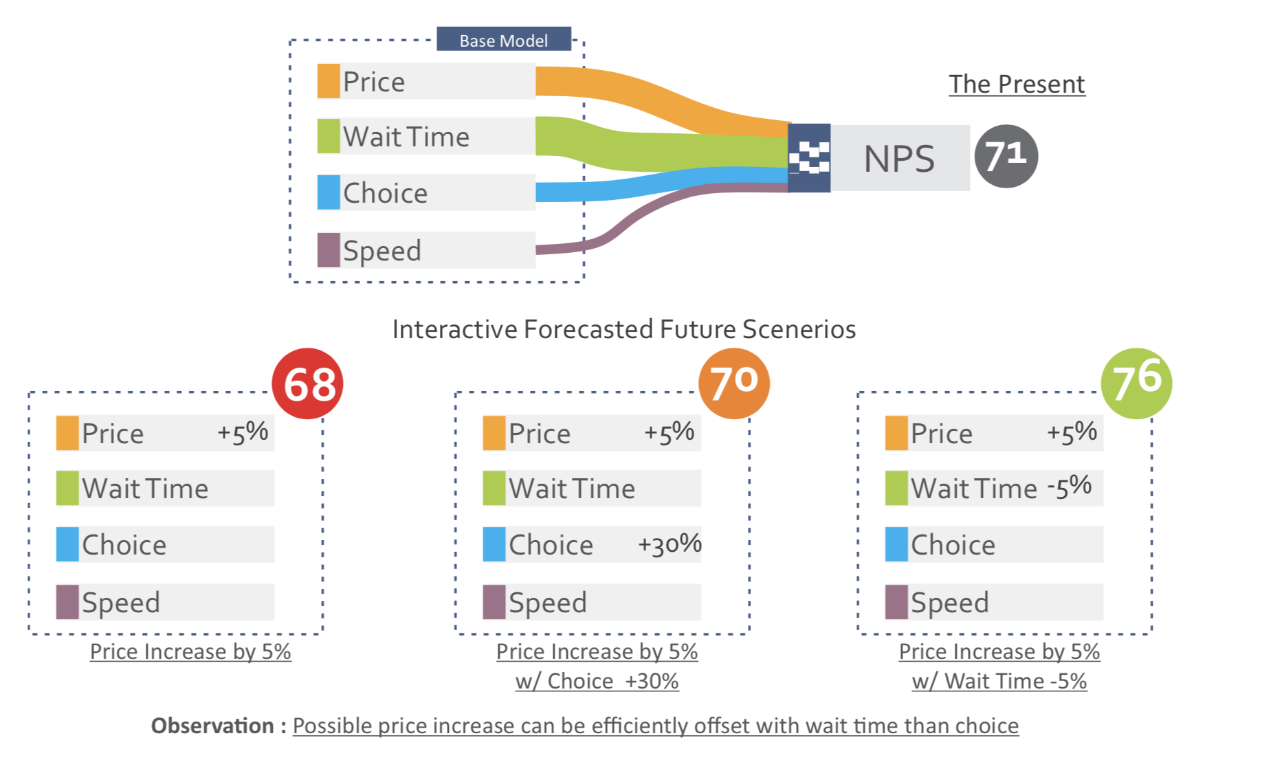
Effective application of predictive analytics can lead to more proactive business decisions making and improve predictability around business decisions impacting customer experience.
Besides being able to build models to predict customer satisfaction on measures such as NPS/CSAT, these interactive models can also forecast service quality, customer retention or traditional financial metrics such as average revenue per customer to establish financial linkages to CX ROI.